It’s Nice That: Typography for the Perth Institute of Contemporary Arts draws from its distinctive architecture
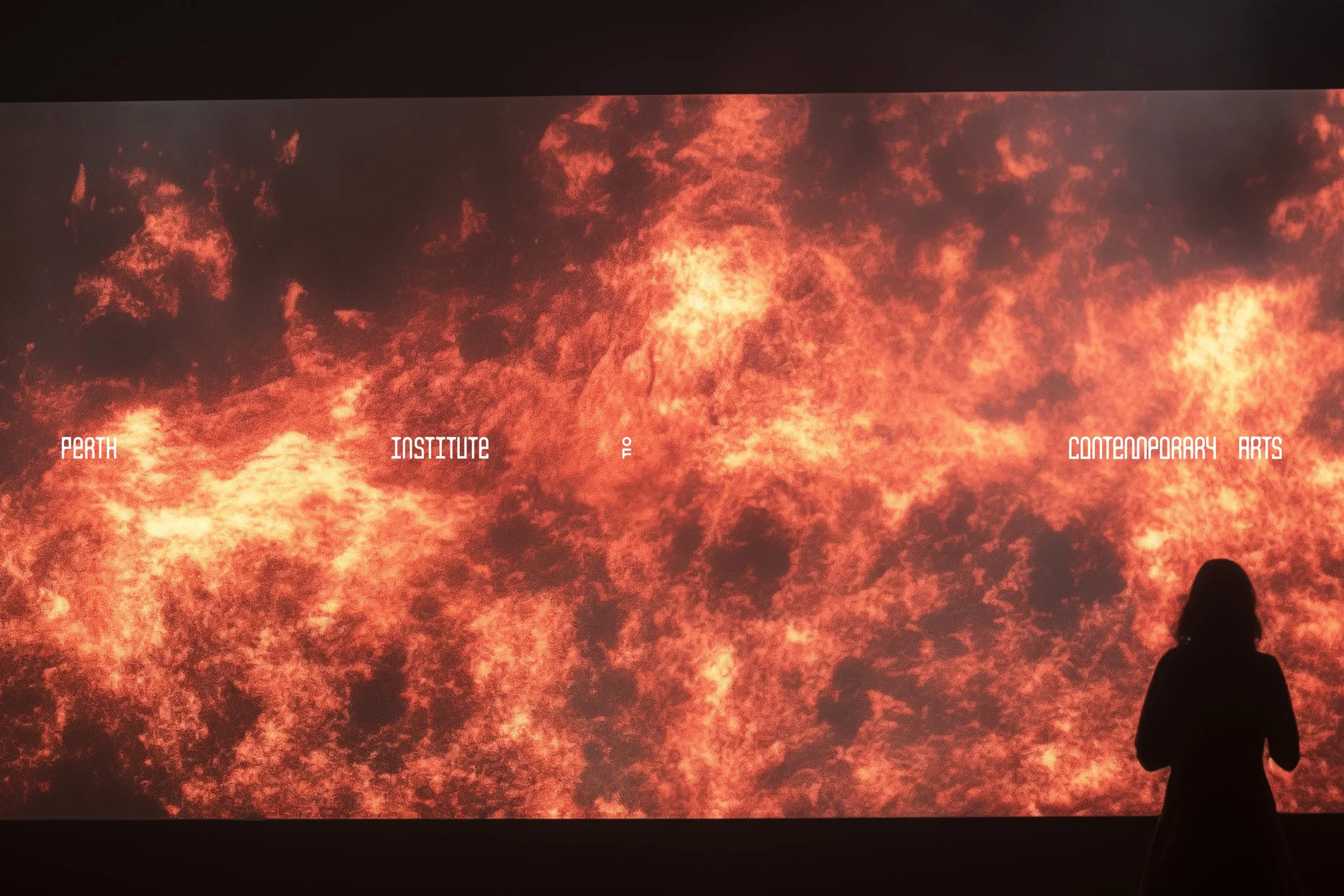
The visual identity by local design studio Block is highly adaptable and site-specific, to transfigure according to each exhibition as well as the institution’s evolution.
Founded in 1991, The Perth Institute of Contemporary Arts (Pica) stands on the site of the Perth Boys School building, where it helped foster the city’s burgeoning creative scene whilst supporting countless up-and-coming contemporary artists. Now, some 30 years on, having garnered a significant international reputation, the institution sought an aesthetic refresh – one that better mirrored Pica’s ambitious approach to contemporary art as well as the esteemed nature of the organisation itself. Turning to branding studio Block, the Perth-based team did just that, establishing a ruminative visual identity for Pica under the brand notion: ‘Cultivating the Provocative. Provoking the Culture’.
Working within Perth’s cultural sector is nothing new for Block, having worked locally in the scene since its founding in 2002. “Living and working in a relatively small, famously isolated city, we’re passionate about fostering a community that values creativity,” co-founder and creative strategy director Mark Braddock tells us, having partnered with grassroots and emerging artists for over two decades. “Our aim was to design a visual identity that transcends subjective aesthetics,” Mark continues, turning to Block’s approach to Pica’s rebrand, “allowing the look and language to evolve organically,” resulting in an ever-evolving identity. “We embrace all reactions – positive or negative,” he continues, “because they capture what it means to be the ‘Grit in the Oyster that is Western Australia, around which Pearls grow.’”
→ Read the full article at It’s Nice That