Kimbara
A wagyu born of two worlds
\ CHALLENGE
Pardoo Wagyu Corporation needed to introduce a second-tier brand — a crossbred Wagyu offering that remained premium but was positioned for versatility and broader application. Crucially, it had to sit alongside, not beneath, the mythic purity of the Pardoo brand. The challenge was one of balance: create an identity that honoured its Japanese lineage and Kimberley origins while feeling accessible, contemporary and distinct. Kimbara needed to be premium — but not precious.
\ OUTCOME
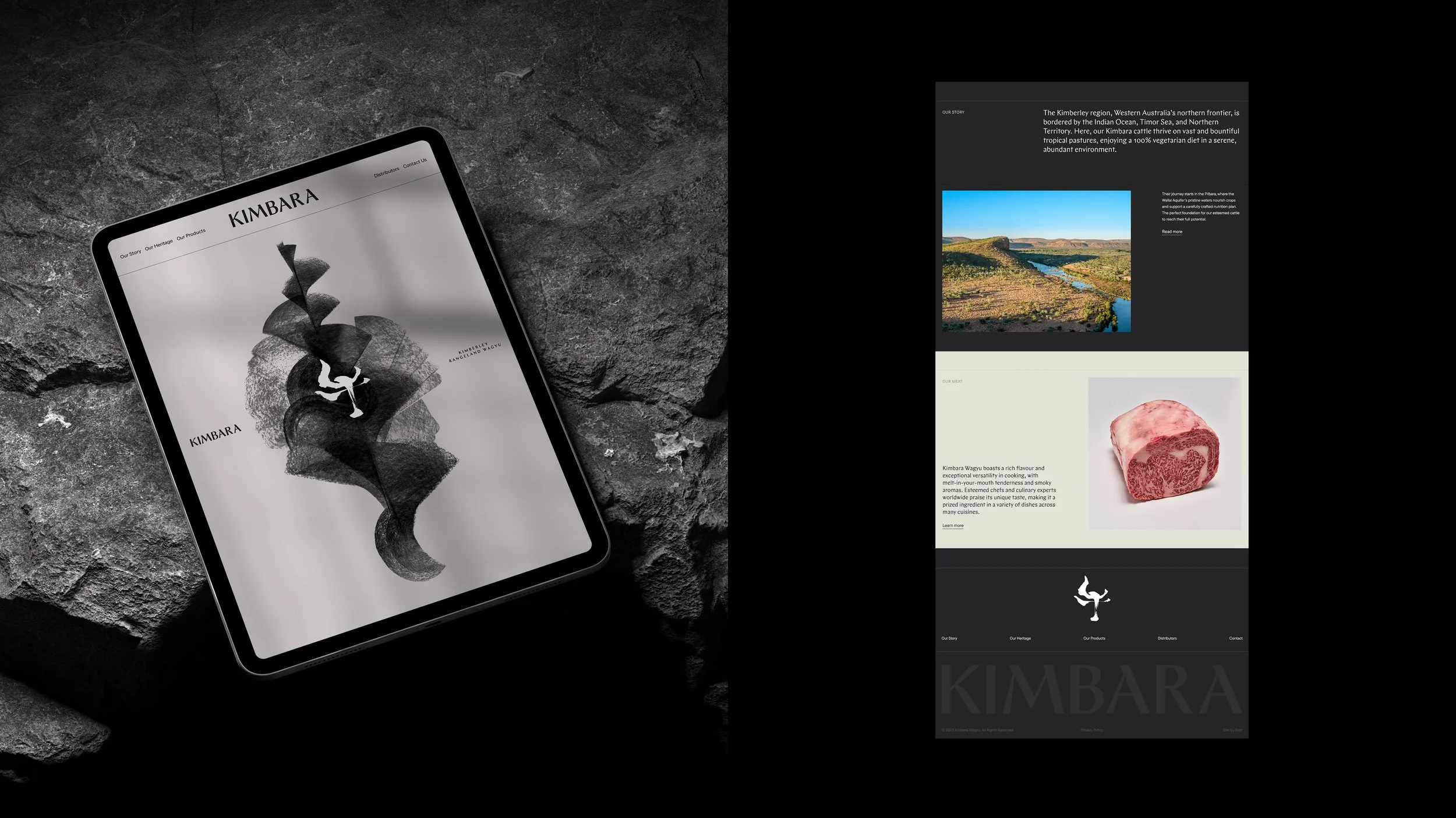
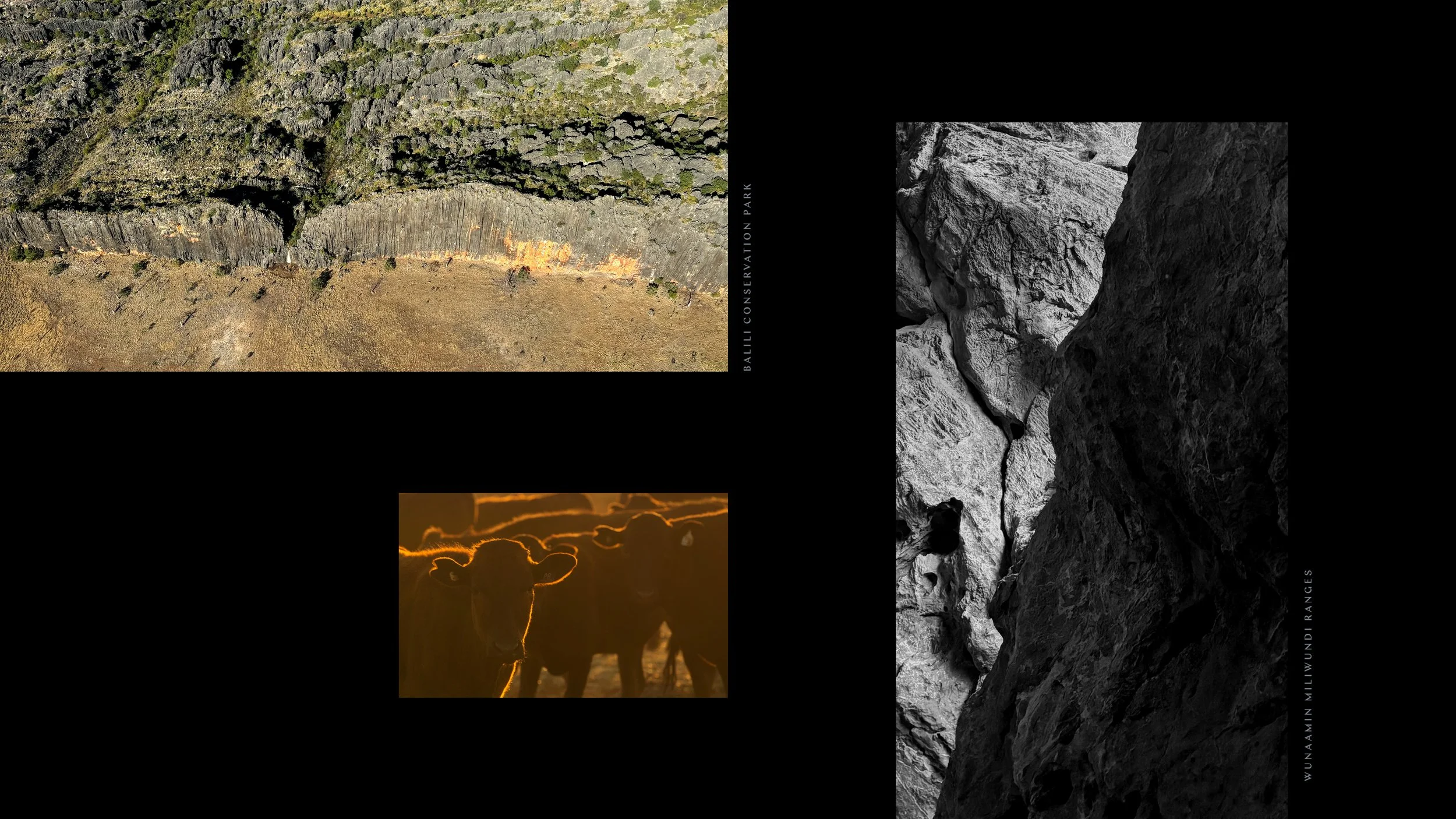
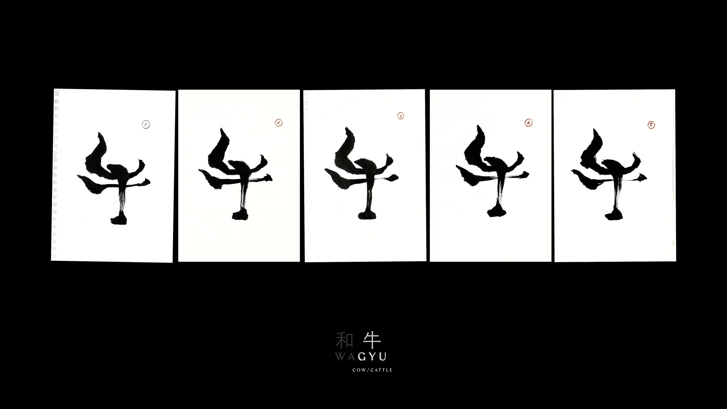
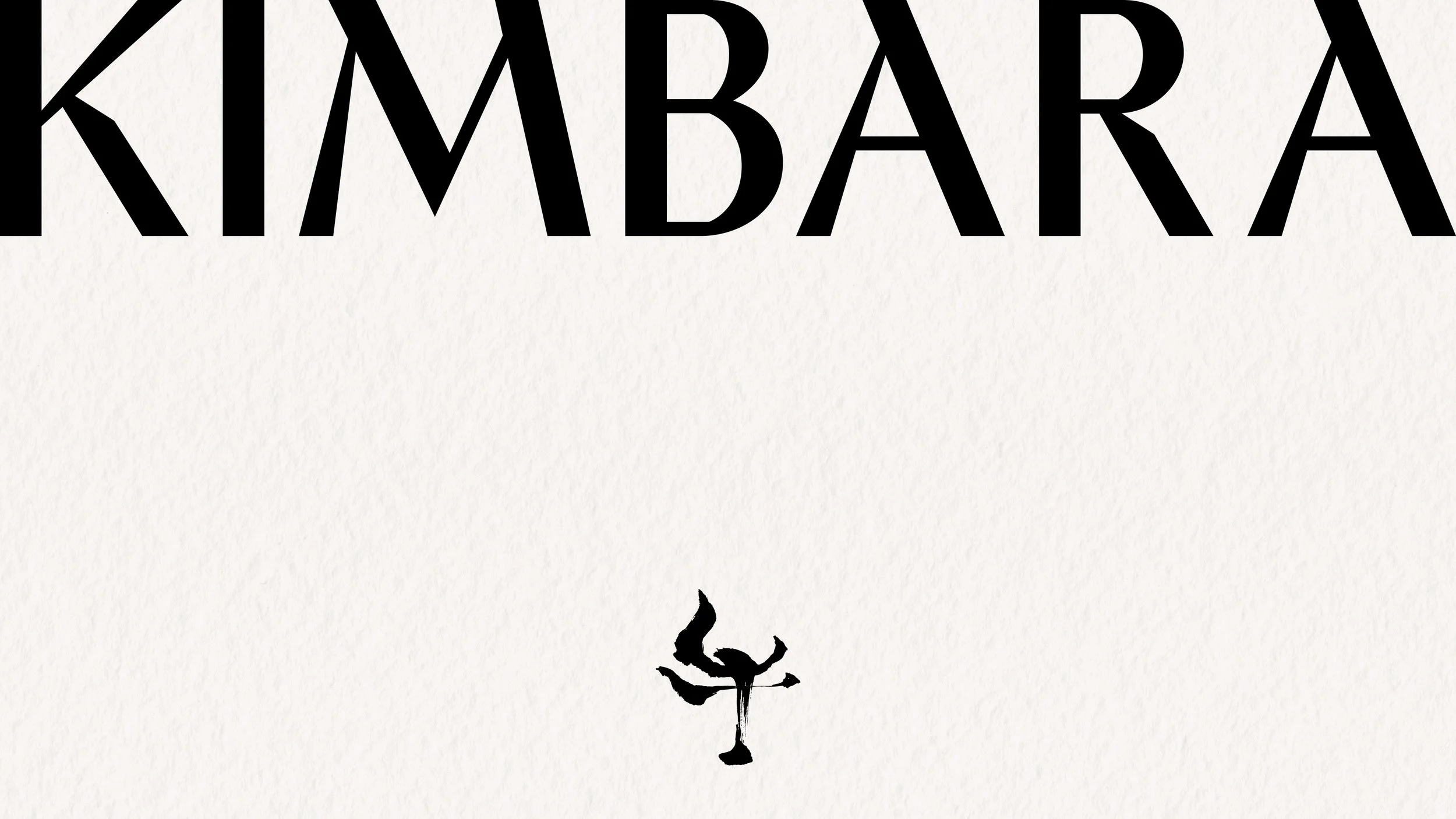
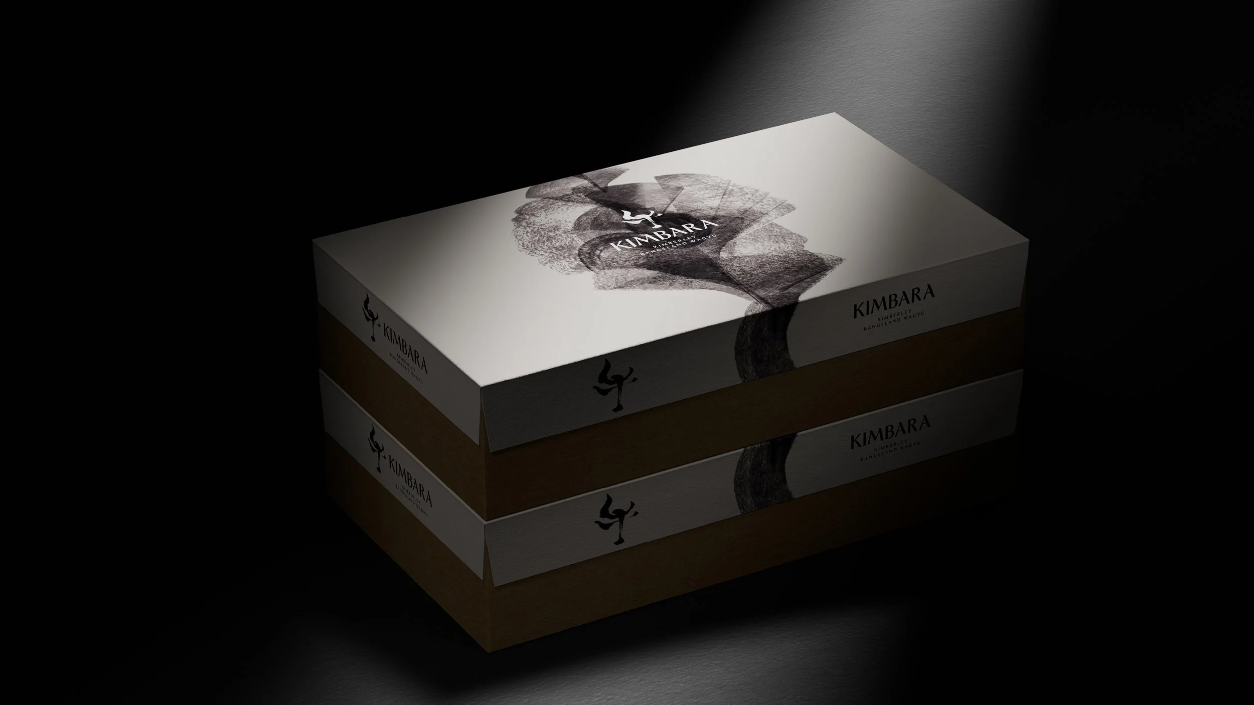
The brand is built from contrast. Japanese bloodlines, raised in the wilds of the Kimberley. Refined craft, grounded in rugged country. Kimbara’s identity draws directly from this terrain — a mineral-rich palette inspired by the region’s iconic black rock formations. At its heart is the Wagyu itself, introduced through a bespoke logomark based on the Japanese character for ‘GYU’ (cow).
To bring this to life, master Japanese calligrapher Maki Shimano was commissioned. Her brushstrokes — elegant, angular and expressive — gave the mark both cultural resonance and visual power. Paired with a bold, modern wordmark, the final identity is a collision of heritage and place. It speaks fluent Wagyu, but with an unmistakable Australian accent.
Kimbara launched as a confident counterpoint to Pardoo — strategically positioned, culturally rich, and visually distinct. It allows chefs to buy by marbling grade without feeling generic. And it proves that premium can still be approachable — a brand shaped by contrast, but united by craft.
Services
Brand research
Brand strategy
Brand positioning
Brand architecture
Brand identity and naming
Brand guidelines and systems
Still and moving image creation
Packaging design
Point-of-sale design
Sectors
Agriculture & Industry
Food & Beverage
Recognition
Perth Advertising & Design Club 2025 Silver
Design: Brand Identity Large
Perth Advertising & Design Club 2025 Silver
Design: Logo