City of Perth: Rebrand
A symbol for today, with a nod to our shared history
\ CHALLENGE
West Australia’s capital has spent sixty years as a city and thousands more as a home. Great work had been done by the council in recent years to address reconciliation and acknowledge local Whadjuk Noongar history but the corporate identity of the municipality, used to celebrate and promote the city, was still a world away from where it needed to be. Block and Nani Creative were enlisted to bring the city’s new era to light.
\ OUTCOME
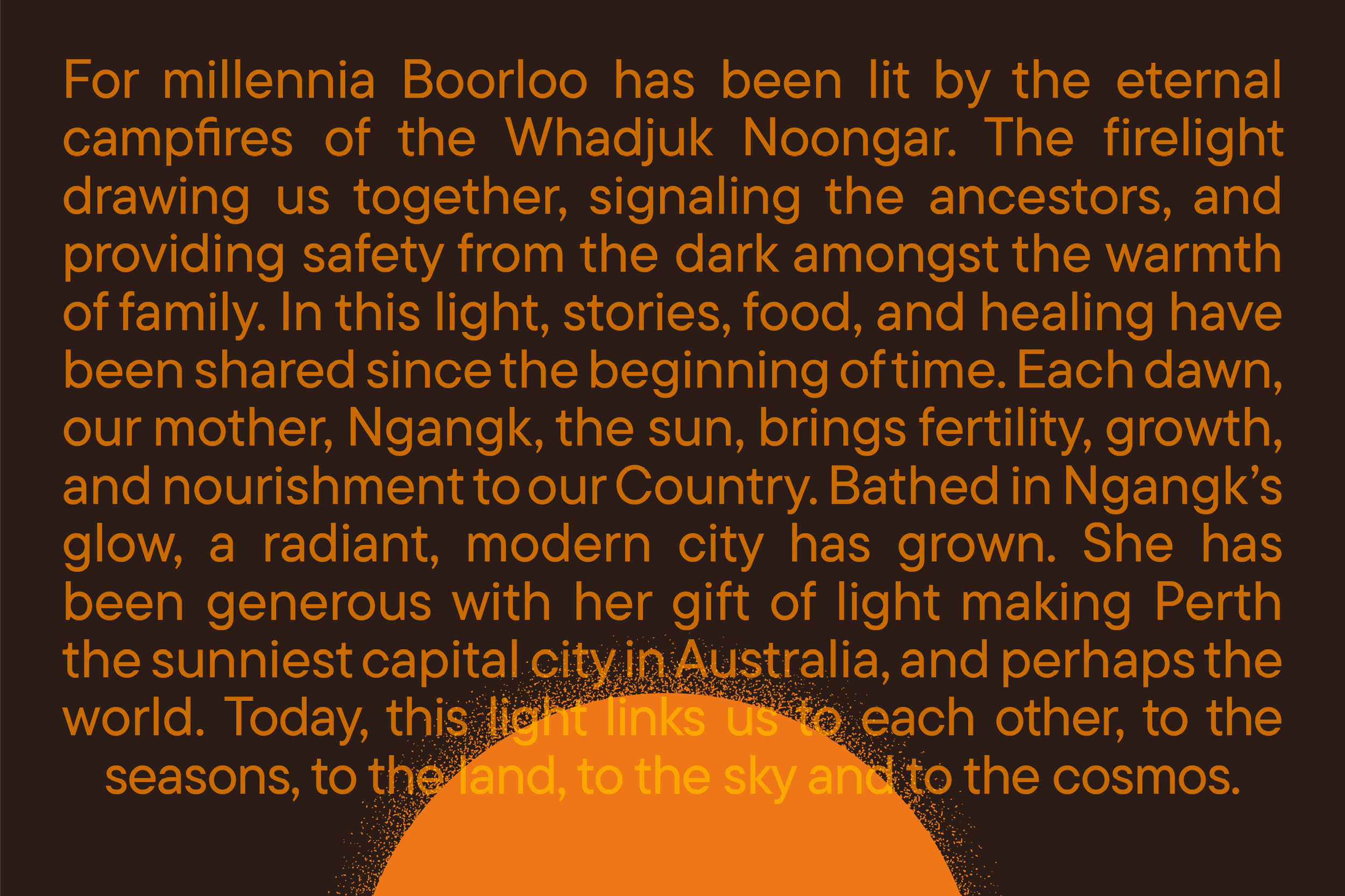
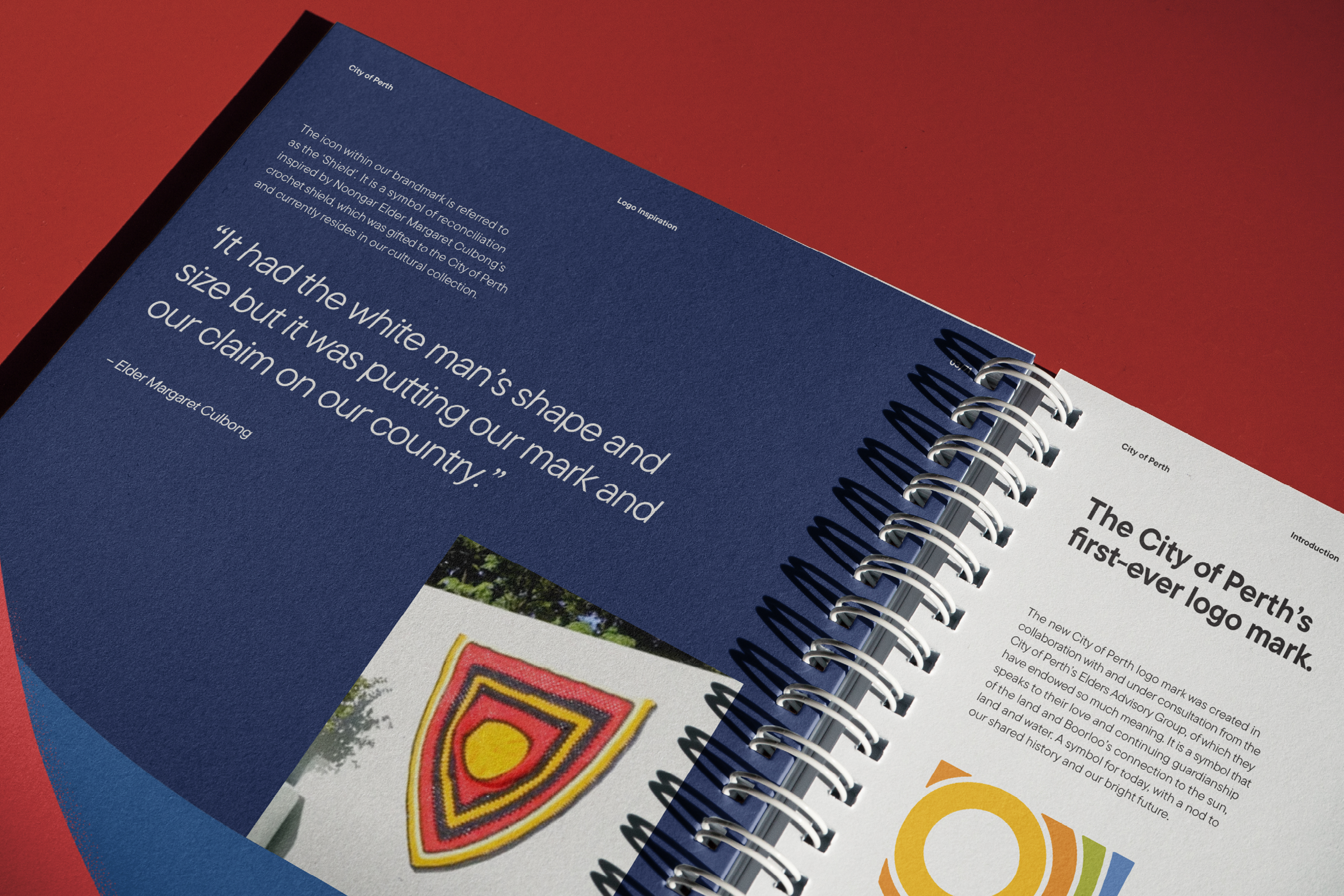
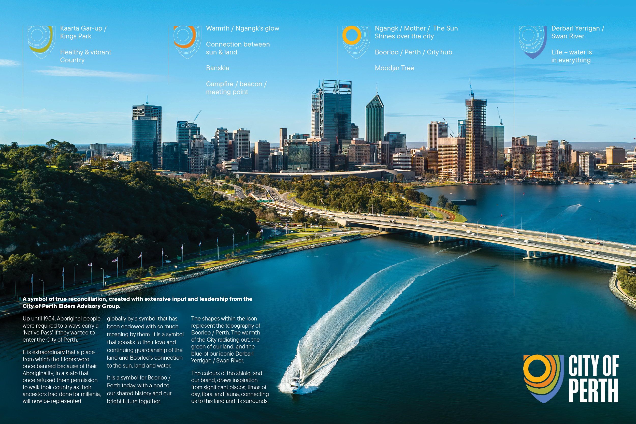
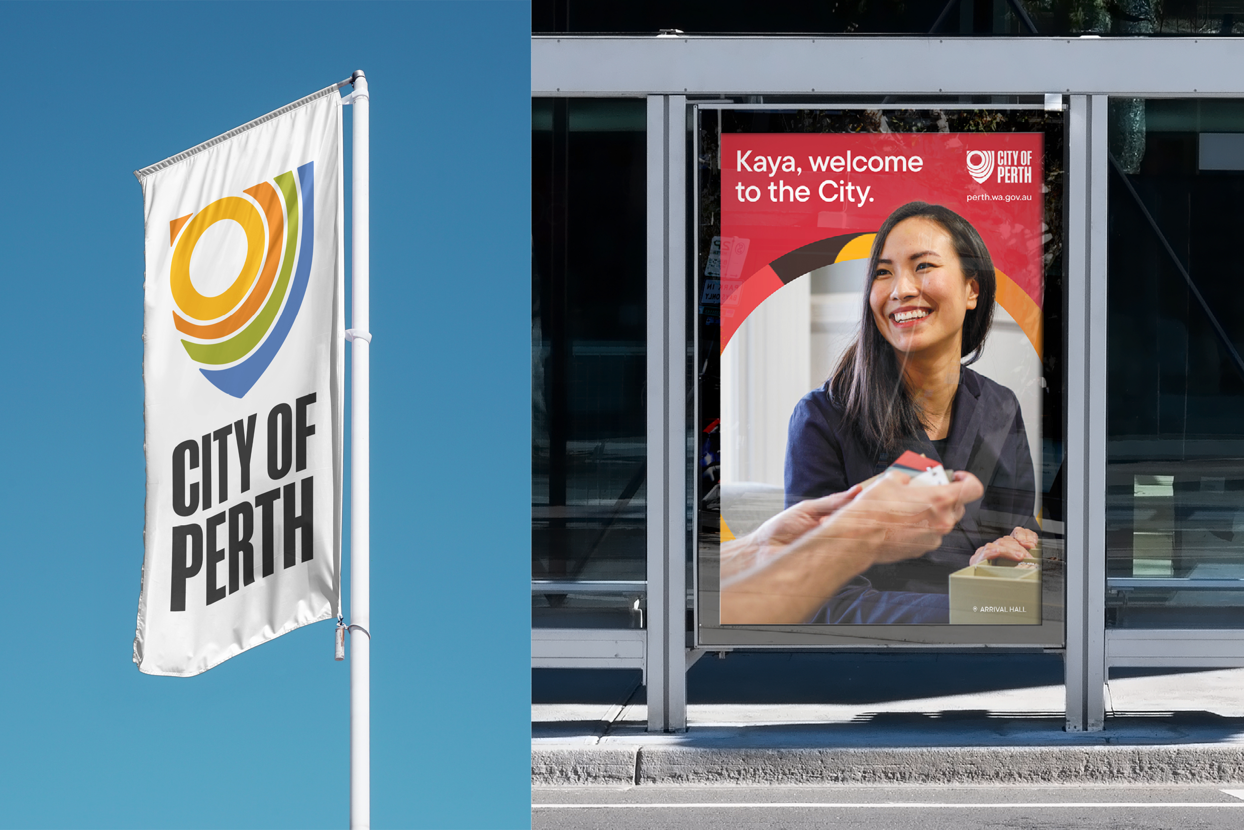
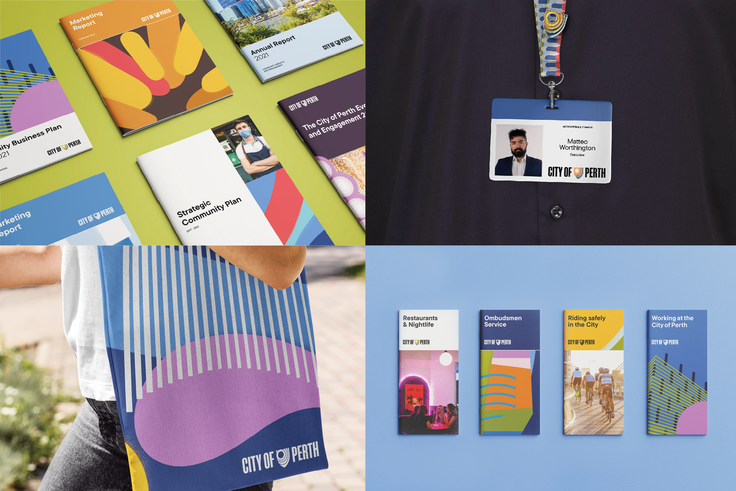
The brand identity, informed by community consultations and the City of Perth’s Elders Advisory Group, includes a new strategy, brandmark, and systems for dual-naming, photography, and graphics. Each element draws inspiration from Whadjuk Noongar culture and the distinct environment of Boorloo / Perth, including its reputation as Australia’s sunniest capital.
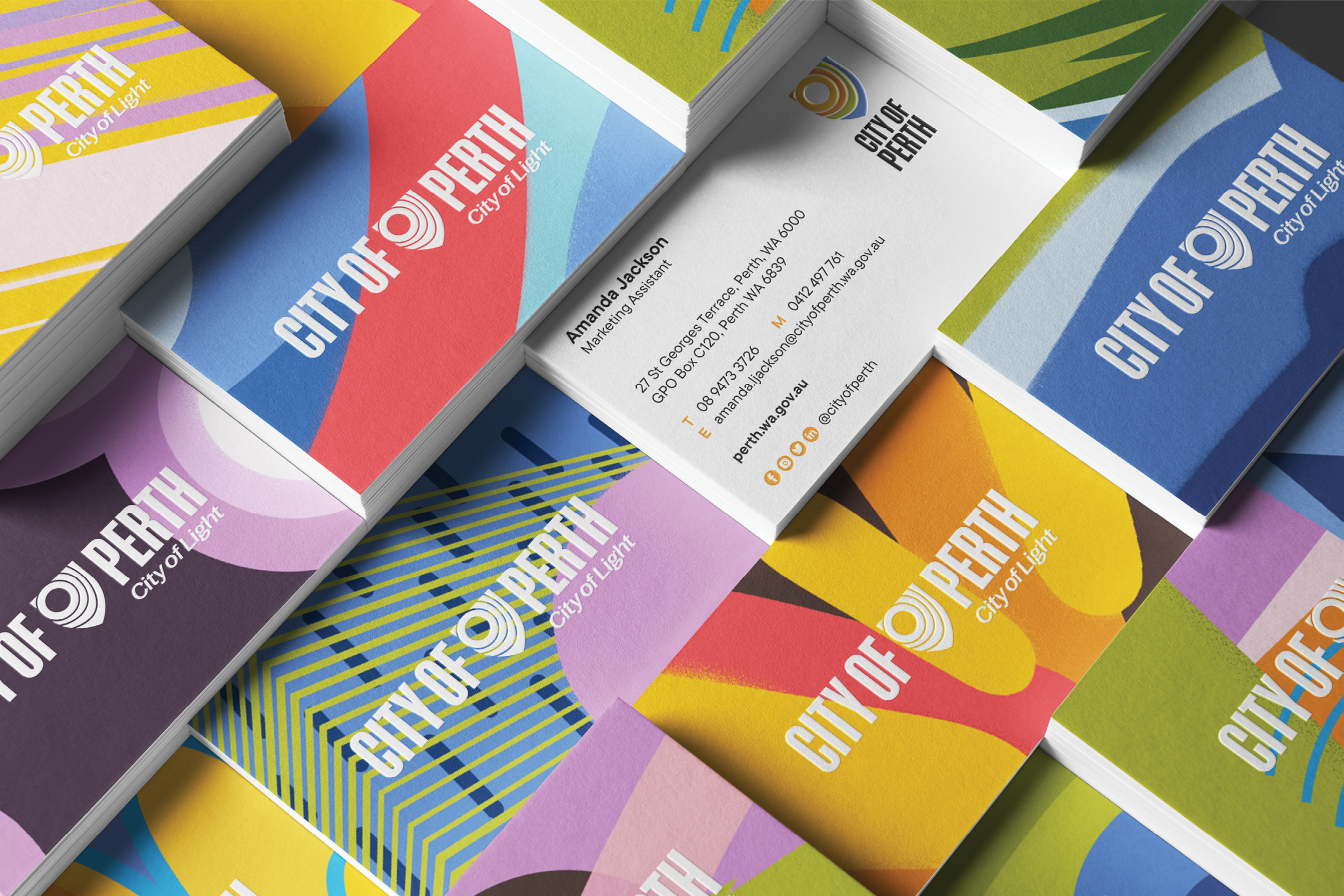
An abstract illustration style was developed to represent well-known landmarks with energy and vibrancy. Brand colours were sampled from local flora and fauna, plus the sky at different times of the day.
Together, the system brings order, clarity, representation, and a unique identity to Boorloo, Perth. Our city of light.
Services
Brand Research
Brand Strategy
Brand Positioning
Brand Architecture
Brand Identity
Brand Guidelines and Systems
Sectors
Local Government
Public Sector
Destination
Recognition
AGDA Design Awards 2022 Finalist
Brand Identity - Large
